New Blog Look
I have been playing around with a new look for my blog and would love to get your honest feedback. What do you think? Is it to busy? Is the background distracting? If you know me at all, you know that I tend to lean more towards clean and simple. This new design is a bit of stretch for me. So, what are your thoughts? Keep it or change it?
I’ll be back later with a little artwork for ya…
*Ü*

You are too cute. I love both artful busy and elegantly simple. I think this is a nice blend. Love the pink and green. Love the touch of wimsy this theme has.
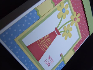
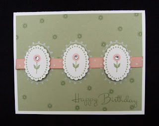
I think the more important question should be, "how do your projects look on the theme?".
I actually read all your posts in my Google Reader so I don't see the theme. Everything is against white. But I came to visit because you asked! =)
Like Princess, I usually check out blogs through Reader and don't see the actual theme. I checked yours out and it definitely is clean and simple, Not too distracting at all.
Love your artwork. Have been a faithful follower for a good long time.
I like it – not too busy at all.
Your blog looks great! Very soft and relaxing not busy and cluttered! I need to work on mine now!
okay, I'll be honest – I have you marked as a favorite place because I love your work. I'm a lurker. Every once in awhile I go through my list of favorite blogs to see what new things people have posted. I was looking at the post of your card inspired by your bedding thinking to myself, "this green background seems different – and not in a flattering way to your artwork." Honestly, that's what I thought and then when I scrolled down I saw this post about the "new blog look." So, I just thought I'd let you know what my initial reaction was. I don't mean to offend in any way. I appreciate that you share your work – and it's still gorgeous regardless of the background!